Inspired by te ao Māori, where breath is understood as a source of mauri and connection, the experience uses
breath as input to activate sound, movement, and environment; guiding users toward awareness, balance, and
relational understanding.
In te ao Māori, hā is embedded in everyday life through practices such as karakia, whaikōrero, pātere, and
pūoro, connecting breath to wellbeing, expression, and the natural world.
Whakahā invites users to slow down, reflect, and reconnect; creating space for personal awareness and deeper
inner work through hā.
Problem statement
Modern health research shows that many people breathe dysfunctionally without realising it. This reflects a
wider disconnection, where breath is no longer recognised as something to care for, learn from, or respect.
In contrast, within te ao Māori, hā is understood as a source of mauri, embedded in everyday life and
connected to wellbeing, expression, and the natural world. There is an opportunity for design to help people
reconnect with the life-giving role of breath.
Design question
How can digital interaction support a return to Māori understandings of hā as a foundational connection
between tinana (body), taiao (environment), wairua (spirit), and whakapapa (relationships and lineage)?
Outcome / Output
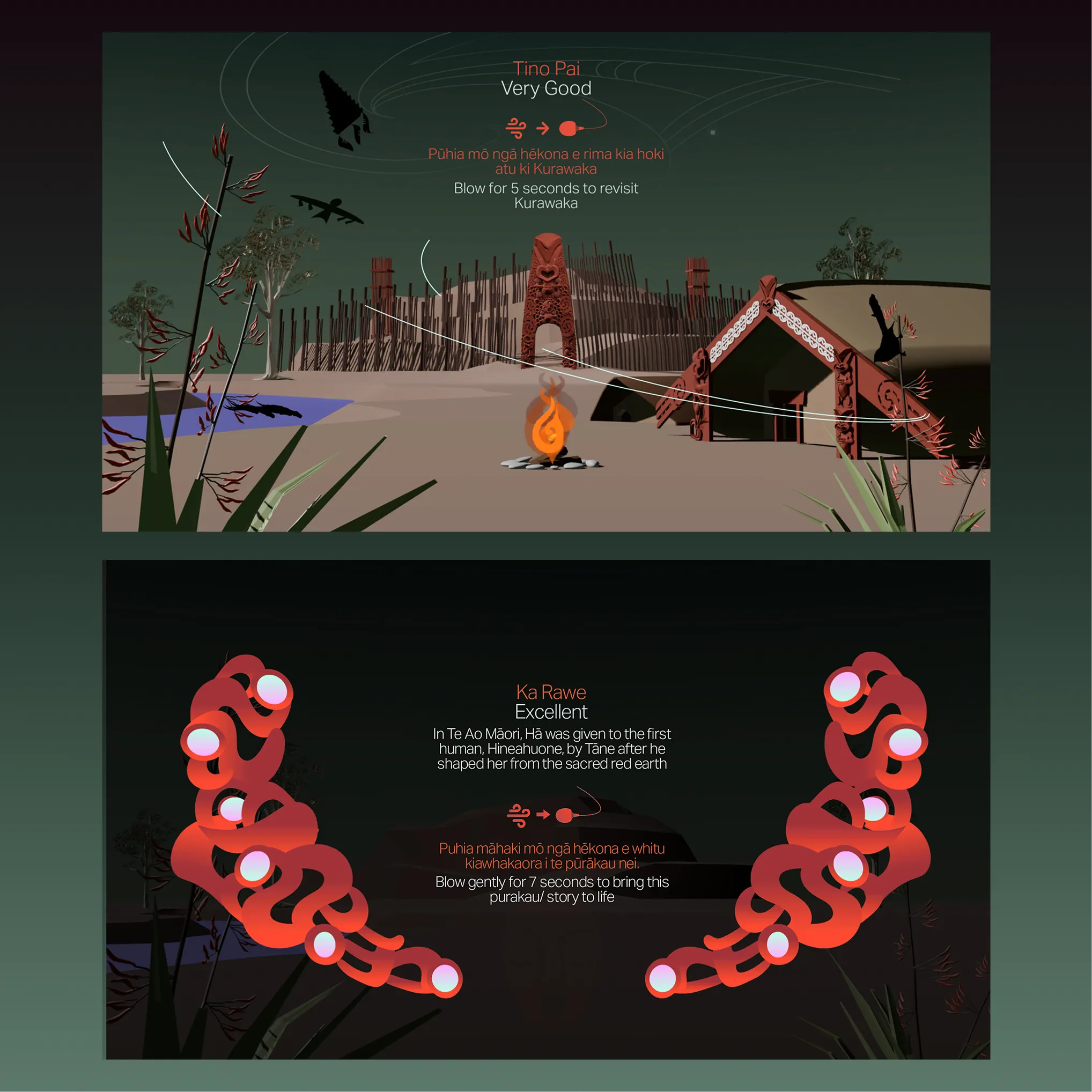
A responsive, story-telling environment where te taiao (the living world) is influenced by our hā;
where breath activates natural, seasonal or cosmic change, bringing mauri and into the space.
Grounded in te ao Māori, te taiao remains the teacher, and hā remains at the centre, expressed through digital form.
Design approach
My design framework positions digital interaction as a bridge
between ancient understandings of hā (breath) and contemporary digital life. The aim is not to instruct
users on how to
breathe, but to create an experience that reawakens respect
for breathing itself. Rather than treating breath as a mechanical
function, the interaction recognises it as a living connection
between people, body, and whakapapa. This reflects mātauranga Māori, maramataka, and the value of observation and
relationship within te ao Māori.
Whakahā acknowledges that there is no single correct
way to breathe, only different levels of awareness and connec-
tion. Whakahā becomes both an act of reindigenisation and a
reminder that digital design can help us rediscover embodied
respect for our hā. Designed to reconnect users with the lost
respect for their breath, body, and ancestral rhythms of life,
Whakahā seeks to leave a lasting impression.
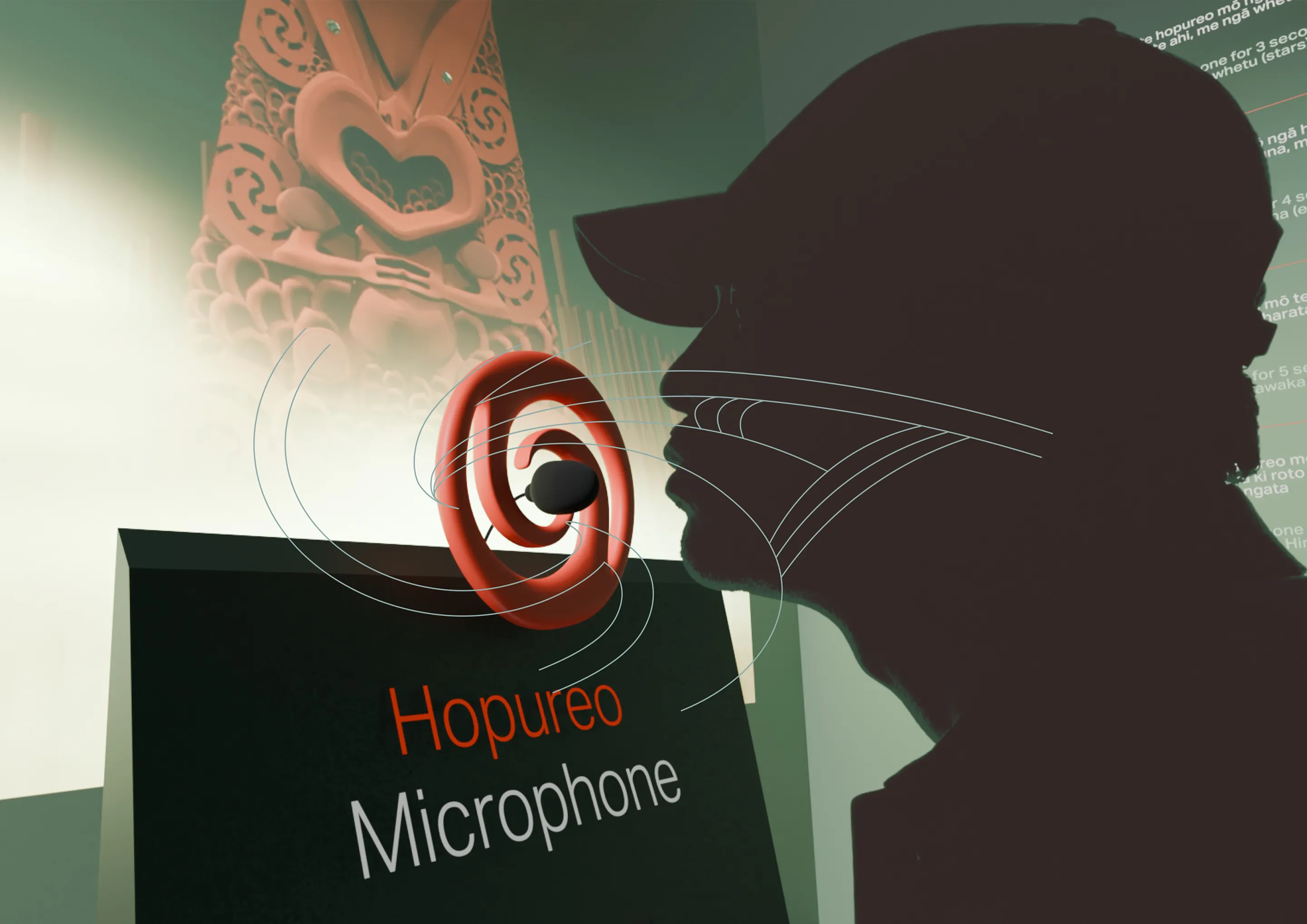
Rather than instructing users how to breathe “correctly”, Whakahā positions breath
as symbolic input. Technology does not judge or quantify breath, it responds to it.
Rejecting metrics, scores, and medicalised breath
Although research supports the benefits of slow, controlled breathing, translating breath into scores,
targets, or performance metrics was intentionally rejected.
Most breath-tracking technologies assume there is a single “correct” way to breathe. This frames breath as
something to be measured, corrected, and optimised. In Te Ao Māori, breath is not mechanical. It is hā
carrying hau, mauri, and wairua, and it changes with environment,emotion, and circumstance.
From an ethical perspective, breath data is deeply personal. Treating breath as data to be
captured, stored, or owned raises serious concerns around user intrusiveness and data
sovereignty, and echoes extractive relationships between bodies and technology.
Trade-off: This meant sacrificing numerical precision, performance feedback,
and the sense of optimisation common in wellness technologies.
Hononga, observation, and letting the land teach
Rather than instructing users how to breathe, Whakahā invites observation. Breath is not
evaluated. It is responded to.
The experience draws on Māori modes of learning grounded in hononga and maramataka,
where understanding emerges through relationship, rhythm, and attentiveness to the
environment. Users are not told when they are doing things “right”. Instead, they observe
how the world responds to their presence over time.
When balance is found, the environment settles and comes alive. When balance is lost,
the world gently quietens without judgement. The land remains the teacher, and the user
learns through noticing change rather than receiving instruction.
This approach preserves dignity, avoids medicalisation, and aligns with tikanga Māori,
where breath is honoured through relationship and balance rather than correction.
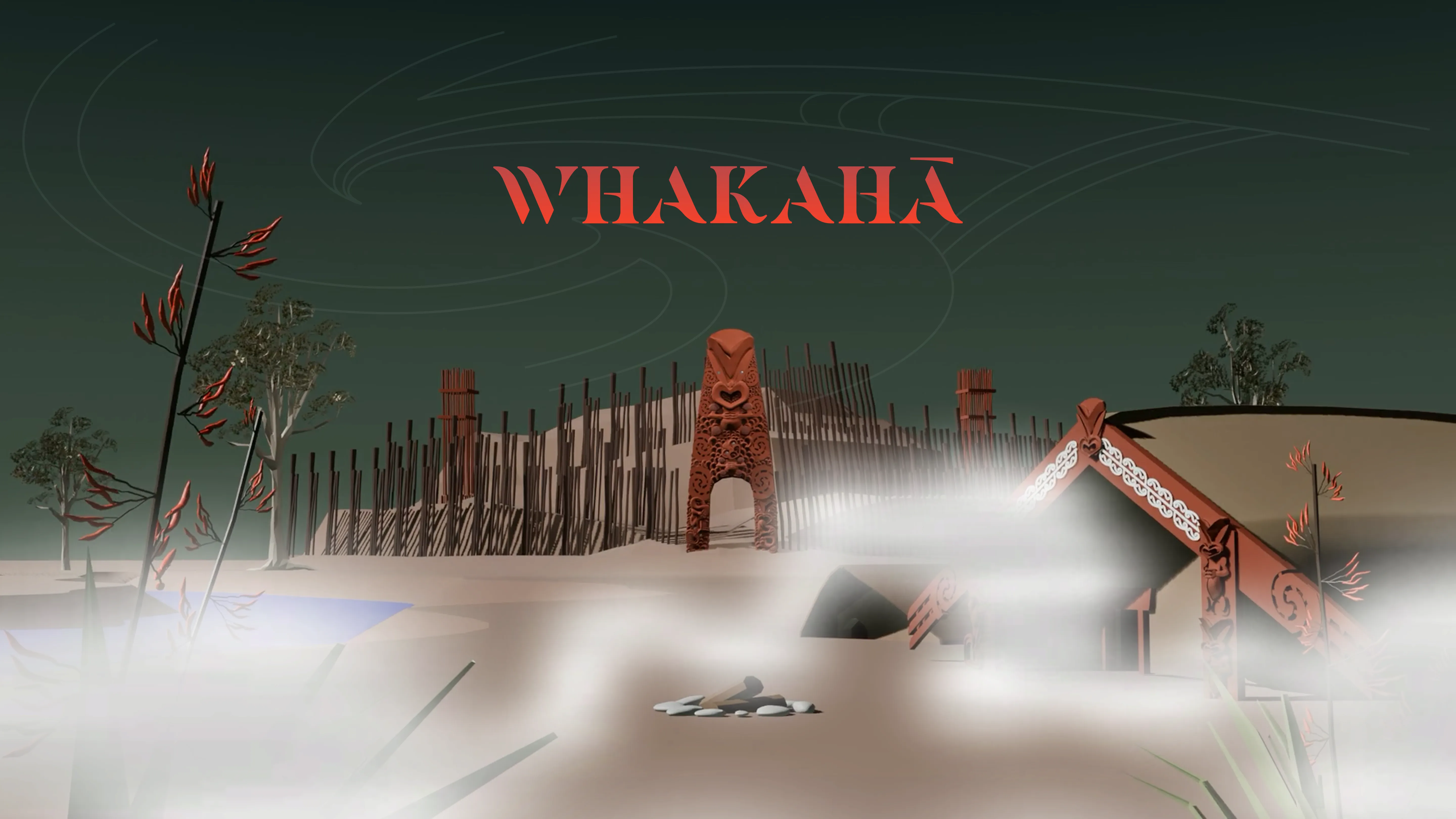
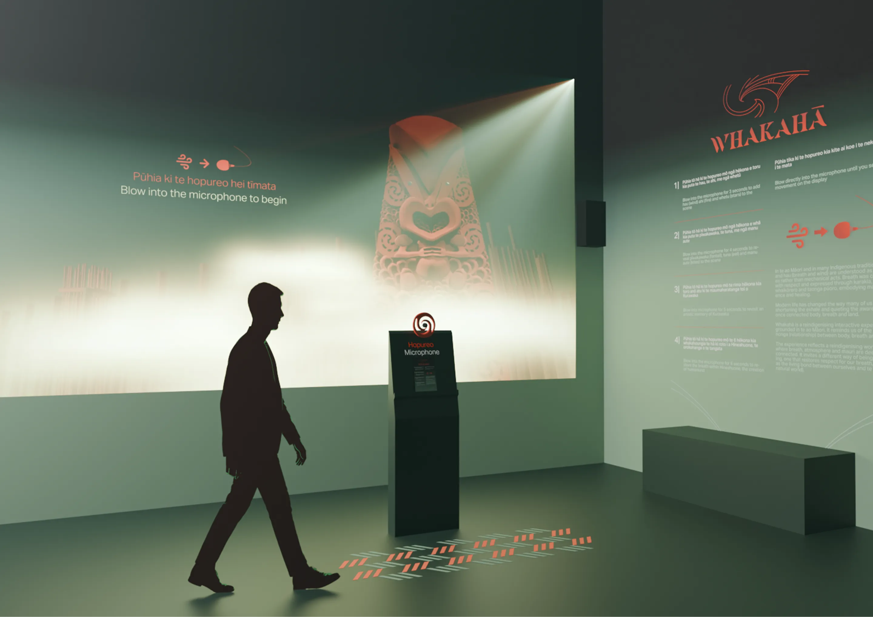
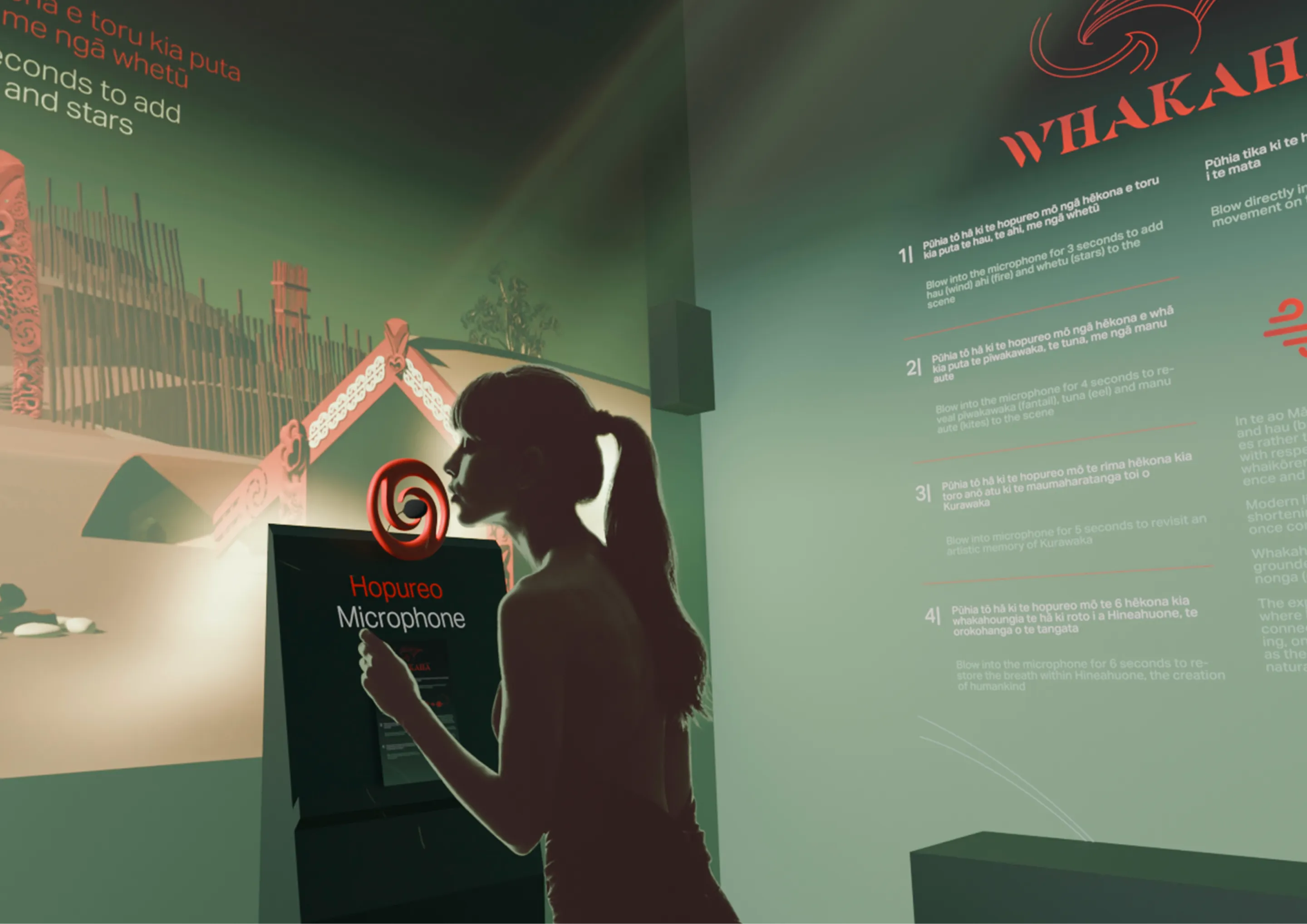
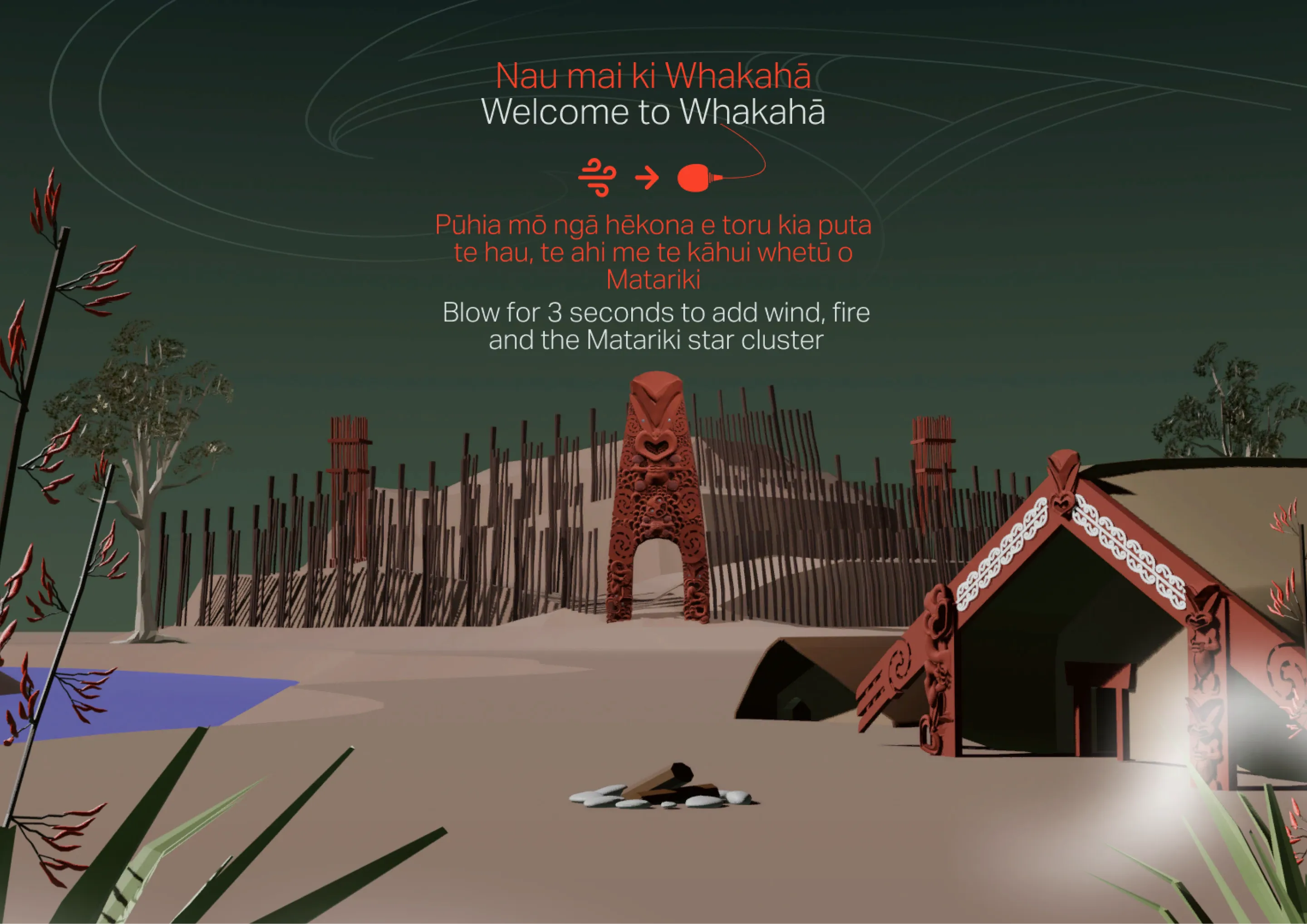
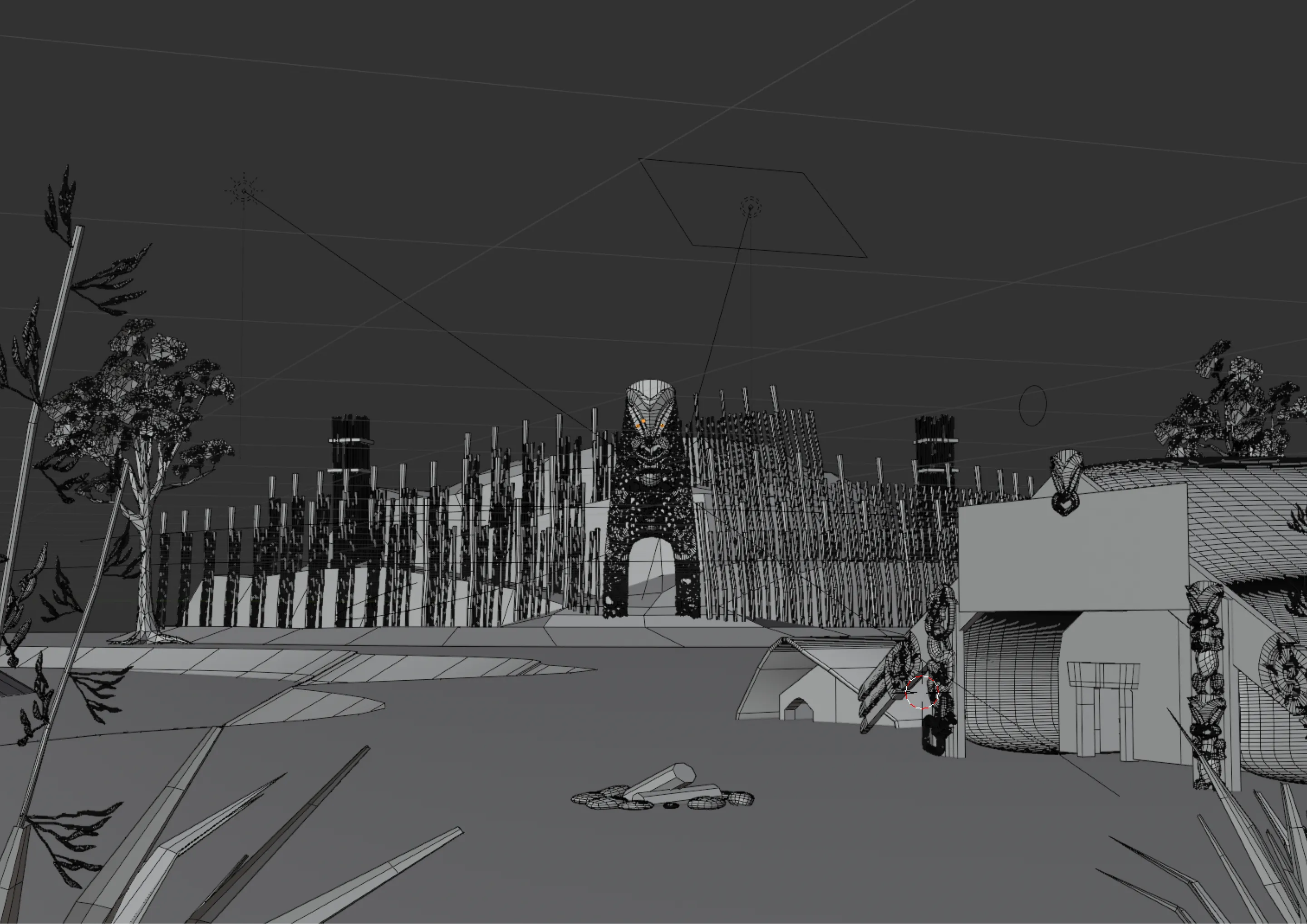
Composition and design
The pā setting acts as a visual return to pre-settler Aotearoa. Rather than depicting the present, the
environment reflects a time where relationships between people, land, and breath were more closely held.
Brand Identity & Story
Visuals
The branding shifted throughout the project, changing from a monochrome orange horizon theme to a dark green
gradient and a hundred in between. The initial orange and brown palette was intended to reference the skies
of Aotearoa and reflect how Māori visual language has traditionally drawn inspiration from the natural
world. However, as the project developed, the orange began to read as more outback or pan-Indigenous rather
than distinctly Aotearoa-specific, unintentionally evoking Australian desert imagery rather than local
whenua and atmosphere.
The shift toward darker greens and blacks better supported the emotional tone of the experience. It
reflected the unsettling, serious nature of breath disconnection, while more accurately evoking the native
landscape and night sky of pre-colonial Aotearoa. The green-black gradient is inspired by Mayor Island,
Tūhua, a highly prized taonga for tangata whenua. Tūhua is unique among obsidian for its deep green tint
when held to the light, and this quality became a visual reference for depth, vitality, and latent life
within darkness.
User testing
Early testing showed that responsiveness to breath was crucial. Zero lag felt significantly more
realistic and impactful, whereas any delay reduced immersion. The original plan was for life to appear
after a timer was met to encourage longer, more complete exhales.
The chronological order needed to be carefully considered. The timing of the scene coming to life had to
make sense immediately, otherwise users became overwhelmed by instructions.
Breathing too big from the beginning would make users light headed, so starting short was a key insight
to story-telling.
UI cards needed to be intentionally positioned. When centered vertically, they obstructed the scene and
reduced anticipation.
Surrounding audio interference would sometimes trigger animations pre-maturely. The audio input was
refined using a high-pass filter to isolate the frequency range generated by breath, improving detection
accuracy and minimising interference from ambient noise. This was important if installation would be
public.
These insights led to:
Immediate visual and audio feedback on exhale
Thoughtful cultural and environmental story-telling
Shorter, safer breath thresholds
Clearer UI phase transitions
Improved scene visibility during UI transitions
Warmer lighting and increased atmospheric depth
Later testing confirmed the experience no longer felt like a game or wellness app, but a reflective,
embodied interaction focused on balance and mauri.
Constraints and trade-offs
Constraints and Tradeoffs
Data sovereignty and cultural alignment
Early exploration included wearables, breath sensors, and data tracking to drive a generative system. This approach felt intrusive and overly medicalised, conflicting with Māori perspectives on data sovereignty and the role of the body.
I instead chose to use a microphone, focusing on breath as a natural trigger for environmental storytelling rather than data-driven generative output. This allowed for greater narrative control and a more emotional, culturally aligned experience.
Technical scope and feasibility
Advanced systems such as volumetric fog, physics simulations, and procedural effects quickly exceeded my technical skill level and project timeframe.
Initial exploration included fog, smoke, and fire simulations, but these were replaced with 2D planes, texture sheets, opacity, and staged animation states.
This tradeoff reduced realism but enabled a more achievable and controlled outcome.
User cognitive load
Early testing showed that too many instructions or layered interactions overwhelmed users.
The experience needed to feel intuitive immediately, with timing and sequencing that “clicked” without explanation.
As a result, interactions and progression were simplified to reduce cognitive load.
Visual immersion and UI placement
UI elements such as cards and overlays often obstructed the environment, reducing anticipation and emotional impact.
This required careful positioning and minimisation of interface elements to preserve immersion.
Complex systems vs readable interaction
Parametric and generative tukutuku systems were explored early on, but proved difficult to control and interpret in real time.
These were replaced with staged, readable visual transitions that clearly communicated cause and effect.
Progression vs meaning
A progressive unlocking system was considered, but the final experience resets entirely when breath stops.
While harsher, this reinforces the conceptual importance of continuous hā as the source of mauri.
Immersion vs instruction
Explaining breath interaction required guidance, but too much UI disrupted the atmosphere.
The final approach uses minimal, on-brand signage to communicate interaction without breaking immersion.
Future
• Add an option for english or māori language at the very beginnning to increase negative space in the UI.
• Work with tohunga to extend narrative and establish more educational story-telling. For example, reveal
what certain stars and winds might mean, or more educational relationships between te taiao and the kainga
village.
• Refine and stylise UI cards to feel more integrated.
• Work with puoro musicians on a more ambient sound track
• Add more 3d movement, camera movement and detail with 3d textures and shaders
Reflection
Reflection
Whakahā began as an ambitious exploration into generative systems and responsive environments, but quickly became an exercise in restraint, clarity, and intentional design. What I initially imagined as a complex, data-driven experience evolved into something more focused; a controlled, narrative-driven interaction where breath activates and restores mauri within the space. This shift was not a compromise, but a realisation that meaningful interaction is not defined by technical complexity, but by clarity, responsiveness, and emotional impact.
If I were to continue developing Whakahā, my focus would be on expanding its spatial depth and immersion. This would involve reworking the current pacing system to support longer, more layered interactions, alongside introducing three-dimensional camera movement and environmental response. While this level of complexity sat outside the scope of a capstone project, it remains a clear direction for future development.
A key learning throughout this project was understanding how interaction logic shapes experience. While I relied on AI support to assist with C# and Unity implementation, this became a tool for learning rather than a shortcut. Through building and troubleshooting systems, I developed a foundational understanding of state management, timing, and how small technical decisions influence user perception. This process challenged me, but ultimately strengthened my ability to think structurally about interaction design.
At the same time, the project clarified where my strengths lie. I am most effective when working at the intersection of concept, storytelling, and visual design. I am drawn to shaping how an experience feels, how it unfolds, and how users move through it. While I will continue developing my technical independence, I see programming as a supporting tool rather than the core of my practice.
Whakahā was also personally transformative. Alongside developing my design process, I deepened my connection to te reo Māori, tikanga, and mātauranga Māori, and began to understand how these knowledge systems can exist meaningfully within digital environments. This project reinforced that design can act as a bridge between technology and culture, not by translating or simplifying, but by creating space for different ways of knowing to be experienced.
Looking forward, I would prioritise deeper engagement with iwi, hapū, and Māori designers to ensure future iterations are guided by collective knowledge rather than individual interpretation. I would also refine my workflow and file management to better support long-term projects, allowing for iteration without losing clarity or direction.
This project taught me how to manage scope, make intentional tradeoffs, and design systems that balance emotion with usability. More importantly, it clarified the kind of work I want to create. I am interested in designing interactive experiences that are grounded in identity, responsive to people, and capable of holding cultural meaning within digital form. Whakahā represents the beginning of that direction, not the end of it.